Hi Guys,
yet another flash animation! This one was a bit tricky, even though its not that crash hot, i think it's an OK effort for my first real animation
As you can see i built the launch platform, then add the rocket i did in flash, then a count down with rocket smoke building up, anyhow i realise i could make it heaps better if i wanted to spend MUCH more time on it
cheers
Sunday, 7 August 2011
Saturday, 30 July 2011
2D Animation - Learning activity 1
Hi again guys!
I realised how different flash is compared to photoshop, in fact i found it extremely hard drawing this boat and it took me much longer than 4hours :-(
Any how upon submitting this activity i realised i set the stage at the wrong size and i found i didn't use layers as much as i could have and i felt somewhat intimidated after looking at Leeann Jones effort, man is that great.
Monday, 25 July 2011
Hero shots - Digital Imaging Assessment
Hi guys,
yet another post, man there is some work involved in this course :-)
Anyhow i had some trouble identifying some of the font correctly, especially the heritage walk one where i matched it best as possible - this is what i find hardest at the moment identifying font families, anyone in that boat?
yet another post, man there is some work involved in this course :-)
Anyhow i had some trouble identifying some of the font correctly, especially the heritage walk one where i matched it best as possible - this is what i find hardest at the moment identifying font families, anyone in that boat?
Thursday, 21 July 2011
Tuesday, 12 July 2011
Sunday, 10 July 2011
Digital Imaging - Learning Activity 9
1. Find 3 examples where a background image has been used on a website. Take a screen grab of each, save them as .jpgs 50 quality 800px wide. Publish your favourite to your blog with a caption of why you like it.
2. Take your "tell-a-story-with-a-flatbed-scan" image and change it to make it into a web page background using Method (where the image receds into the background colour). Save it as a jpg 50 quality 930px wide.
3. Make a background for a web page using method 4 (1920px wide jpg, a few pixels tall, save as 100 quality). To test your image on a web page, download the Method4.zip folder, unzip the contents, locate and overwrite the bg.jpg file with your version then open the page in your browser.
Take a snapshot of your browser (PrtScrn on PC or on the Mac use the myriad of options) copy it into a new file in Photoshop, save as a jpg for your blog.
4. Make a seamless tile using method 5. Save as .jpg or .gif, whichever gives you the best quality for the lowest file size. To test your image on a web page, download this zip folder, unzip the contents, locate and overwrite the tilebg.jpg file with your version then open the page in your browser.
Take a snapshot of your browser (PrtScrn on PC or on the Mac use the myriad of options) copy it into a new file in Photoshop, save as a jpg for your blog.
 |
| I liked this one the best because its not over powering and doesn't take away the main focus of the site to much |
2. Take your "tell-a-story-with-a-flatbed-scan" image and change it to make it into a web page background using Method (where the image receds into the background colour). Save it as a jpg 50 quality 930px wide.
 |
| Just to let you guys know i would never ever use my flatbed scanned image on any website, it is absolutely horrible, its just portraying method 2, cheers :-) |
3. Make a background for a web page using method 4 (1920px wide jpg, a few pixels tall, save as 100 quality). To test your image on a web page, download the Method4.zip folder, unzip the contents, locate and overwrite the bg.jpg file with your version then open the page in your browser.
Take a snapshot of your browser (PrtScrn on PC or on the Mac use the myriad of options) copy it into a new file in Photoshop, save as a jpg for your blog.
4. Make a seamless tile using method 5. Save as .jpg or .gif, whichever gives you the best quality for the lowest file size. To test your image on a web page, download this zip folder, unzip the contents, locate and overwrite the tilebg.jpg file with your version then open the page in your browser.
Take a snapshot of your browser (PrtScrn on PC or on the Mac use the myriad of options) copy it into a new file in Photoshop, save as a jpg for your blog.
Tuesday, 28 June 2011
Digital Imaging - Learning Activity 8
Hi Guys,
Here's my Being Green work, I found that the best picture format choice here was the JPEG as my images have lots of gradients and tones "as most natural images do". Also i noticed that the jpeg was 2 times smaller in size than the gif and much better quality and over 4 times smaller the png.
I Find that being green in this day and age is a responsibility of us all. Below, some of my images are reserves or world heritage places, to me that is being green and preserving it for future generations. The two big pictures below are "My Compost, not a very good one" and the natural sewerage system that we have out here at Evandale is only one of two in Tasmania. The rest of the photos are things you'll find around most houses, but we try to think of the environment in all aspects of life including computer hardware and even web hosting my choice is HostGator as they only use Wind Energy to power all their servers to help offset server emissions.
Thursday, 23 June 2011
Digital Imaging - Learning Activity 7
Hopefully this is ok, i found a creative commons license picture for the main central image which is a famous game title that all true gamers would recognise. The big fella in the middle is called a "big daddy". I divided the layout into 9 grid layout with 2 for each side and 5 for the middle
Wednesday, 22 June 2011
Digital Media - Learning Activity 6
I Decided to do mine on the dukes of hazzard, an old TV show i use to love as a kid. I really wanted to have the car red but it was always to grainy so i went for the whitish colour
Monday, 20 June 2011
Digital Media - Activity 5
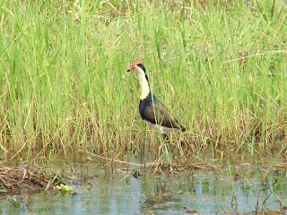
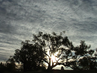
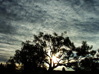
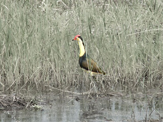
Because of the weather over the last few days its been hard to take pictures for this activity, so i decided to use some from my last trip around Australia.
 |
| Jesus Bird - Before Adjustments |
 |
| Dig Tree - Before |
 |
| Dig Tree - After I like this one! with just adding Vibrance, Levels and Brightness/Contrast adjustments the clouds look nice with the tree being sharper |
Sunday, 19 June 2011
Digital Imaging - Learning Activity 4
Hi guys, i decided to use some photos from the last weekend in holidays and some from a website i have been doing for a friend
 |
| Original Photo |
 |
| Cropped photo - reason i really cropped this photo was to get the hand out of the photo and i left the guy in the centre as i believed it adds better effect to this photo |
 |
| Original Photo |
 |
| Cropped Photo - changed the angle of picture and gave a bit more attention to the waves up close and a bit more emphasis on Lewis (my crazy boy in the water on Saturday) |
 |
| Original Photo |
 |
| Cropped Photo - cropped it so the monkey is looking out to the right of photo and made him off centre and i believe it give a curiosity feel about the photo now |
 |
| Original Photo |
Digital Imaging - Learning Activity 3
Hi Guys, im finally back into study again. I decided to do my story on Christian media that has had a big impact
on my life. I tried to arrange it from oldest (in the background) to the most recent media at the front.
on my life. I tried to arrange it from oldest (in the background) to the most recent media at the front.
Monday, 9 May 2011
Tuesday, 19 April 2011
Activity 12
- Good Type
 |
| The Type here fits well with the image, clear and bold |
| Good type for sport, and nice use of color on blue background and association between word and number |
 |
| Clear type that fits well with business image, white font on red background really stands out too |
 |
| White on red background stands out, also the type style goes really well with the architectural design of the building |
 |
| Green and white complement each other on the black background, also the type fits well with the business logo |
- Bad Type
 |
| Horrible, i can't understand the need for the ugly crossbars on the A's and the arms (i think) on the E's |
 |
| Plain and ugly, not very inviting for a pet shop. The type is consistent here but their main logo is a different type |
 |
| Can't really understand this except the work "sick" |
 |
| Terrible colour, faded and looks like a kid sprayed it |
 |
| I don't think the font is that bad here, it's just the background that is over powering and makes it hard to read and takes away your attention from the writing, there's no real focus i think |
Monday, 18 April 2011
Design Module Assessment: Promote Your Blog
I thought it was fitting to try and have a picture of a korrigan for my theme, for
anyone that doesn't know what a korrigan is its a mythical creature (bad fairy)
Its great that google and yahoo now have added supported for Creative Commons copyright searches.
I did quit a bit of work in photoshop to get the image to look how i wanted it. I then created a
speech bubble coming from the birds mouth and filled it with a tag cloud full of words with what i came across
during the design module.
I put a gradient in the background to give a seperated feel about it and i chose the colour orange to give the
korrigan a friendly look and feel
With the font i wanted to choose a font type that was somewhat curved, rounded and smooth like the Korrigan's hair, boats etc.. to give it a more uniformed feel
I still feel the speech bubble lets it down a bit and probably should have been a natural object of some sort, anyhow its done now :-)
Monday, 4 April 2011
activity 13
Hi Guys,
Once i decided on what quote i wanted to use i identified the words that really stood out to me that should be emphasized. I decided to make all the text that didn't need emphasizing a font that was easy read and looked good for poster design (DIM Medium). For the emphasize word "PAST" i used Bookman Old Style and added a pattern overlay to make it look older, and i also added the word "PAST" repeated behind it but fading way to add effect. With the emphasized word "FUTURE" i used a modern futuristic font called Aldo's Nova and made it big and bold.
Once i decided on what quote i wanted to use i identified the words that really stood out to me that should be emphasized. I decided to make all the text that didn't need emphasizing a font that was easy read and looked good for poster design (DIM Medium). For the emphasize word "PAST" i used Bookman Old Style and added a pattern overlay to make it look older, and i also added the word "PAST" repeated behind it but fading way to add effect. With the emphasized word "FUTURE" i used a modern futuristic font called Aldo's Nova and made it big and bold.
Thursday, 31 March 2011
Activity 9
Hi all,
very interesting activity, i loved this one and learnt heaps, specially by reading the extra material
very interesting activity, i loved this one and learnt heaps, specially by reading the extra material
- Website
- Newsletter
- Business card
Tuesday, 29 March 2011
Monday, 28 March 2011
Activity 8 - Grid Layouts
Subscribe to:
Comments (Atom)


